Self-Titled Album Identity
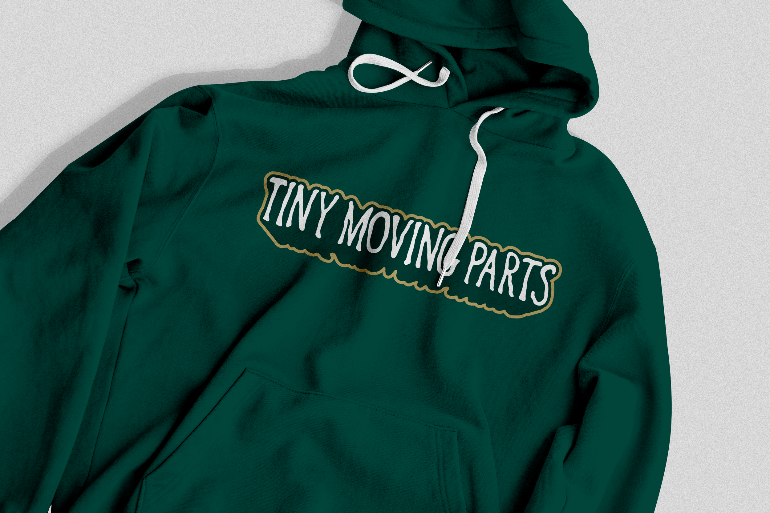
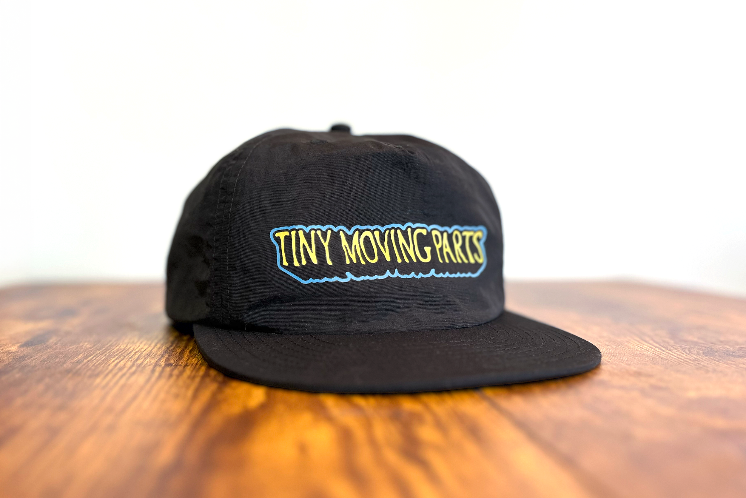
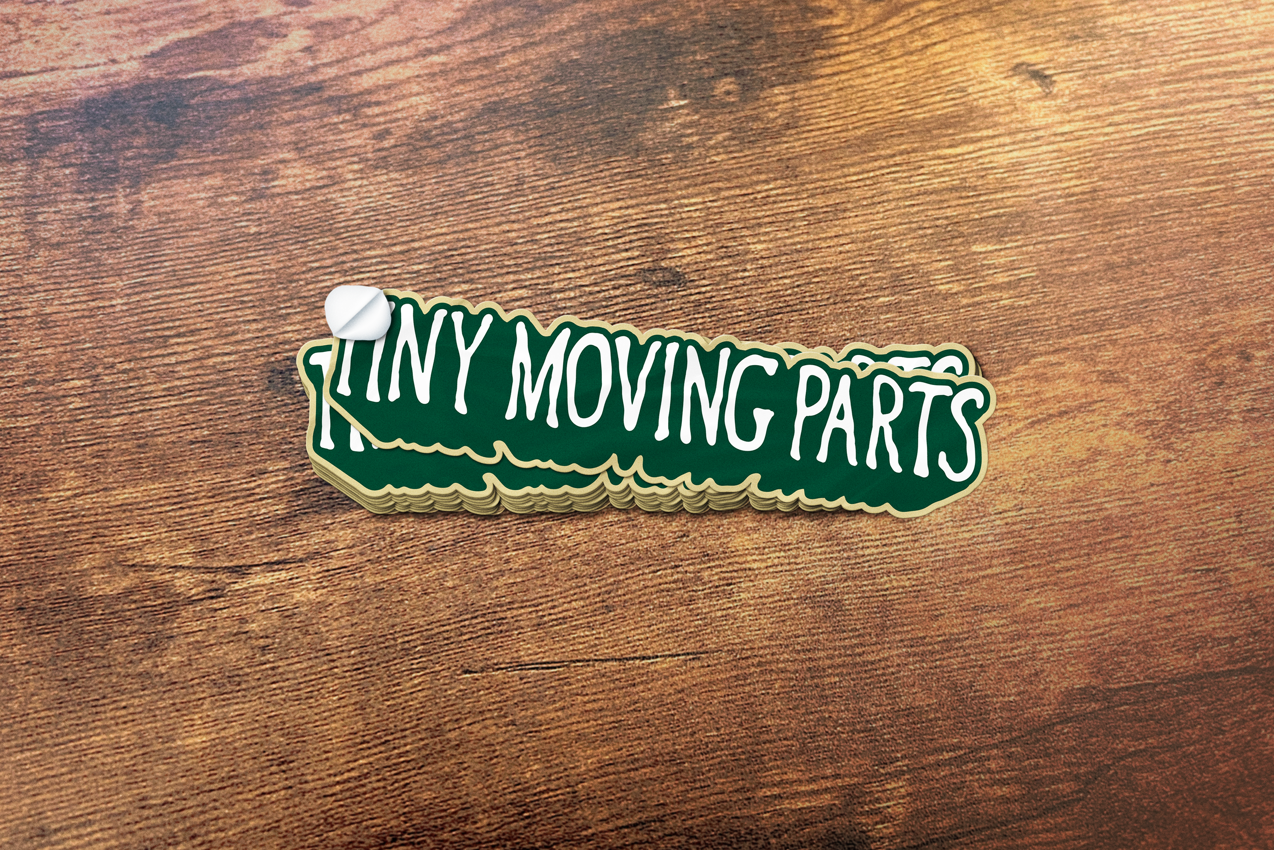
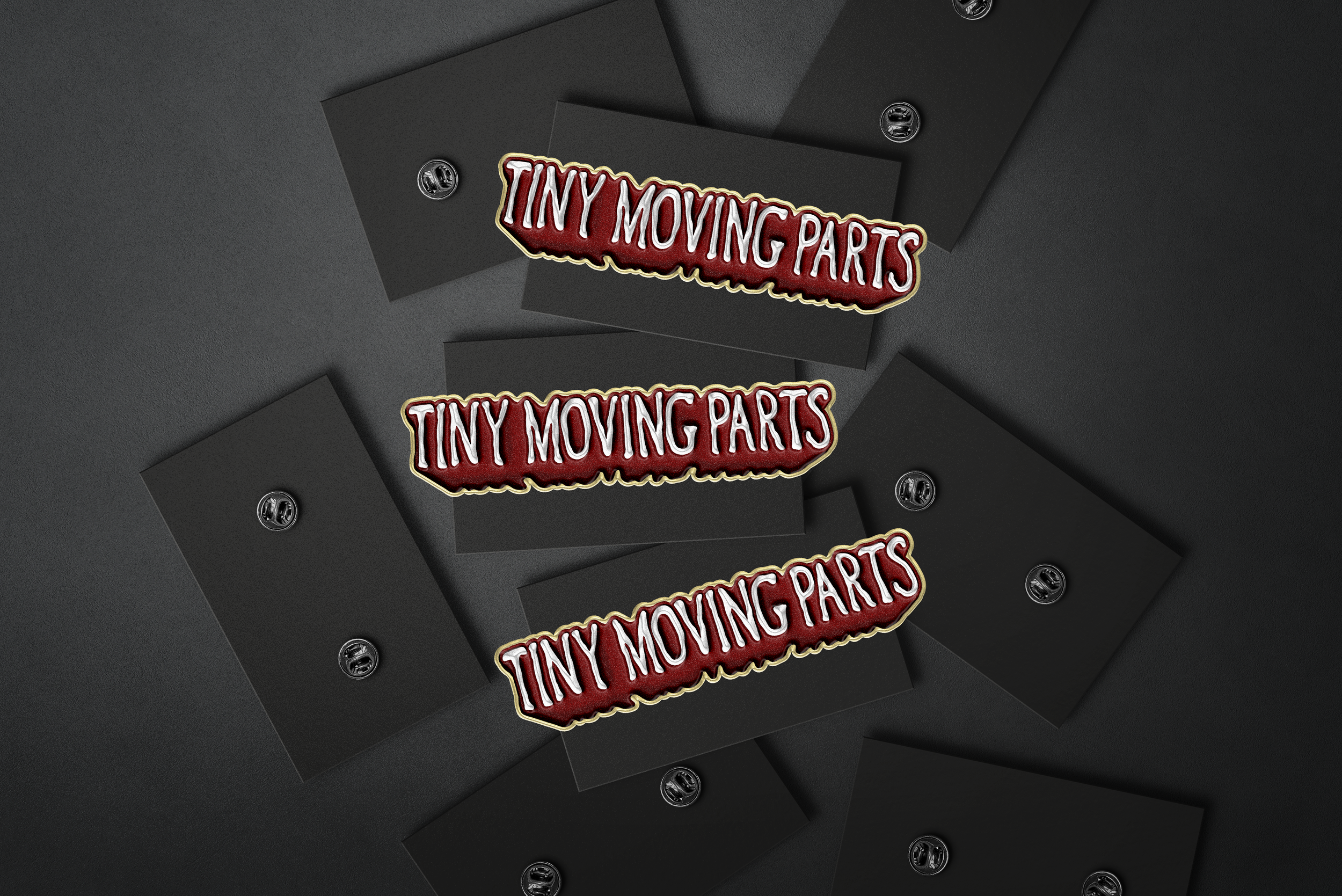
One challenge the band faced with its long name was that the three words didn’t stack well, and a single long line of text had limited flexibility for merchandise designs. To address this, I carried over the drop shadow effect from the previous identity on the breathe album cover, allowing the name to stand out on its own and enabling more minimal, clean merchandise applications. To complement the condiment spelling used on the self-titled album cover, I developed an oozing, hand-drawn style for the lettering and outline.